 Website Designing
 Web Development
 Mobile Applications
 Marketing
 CMS & Ecommerce
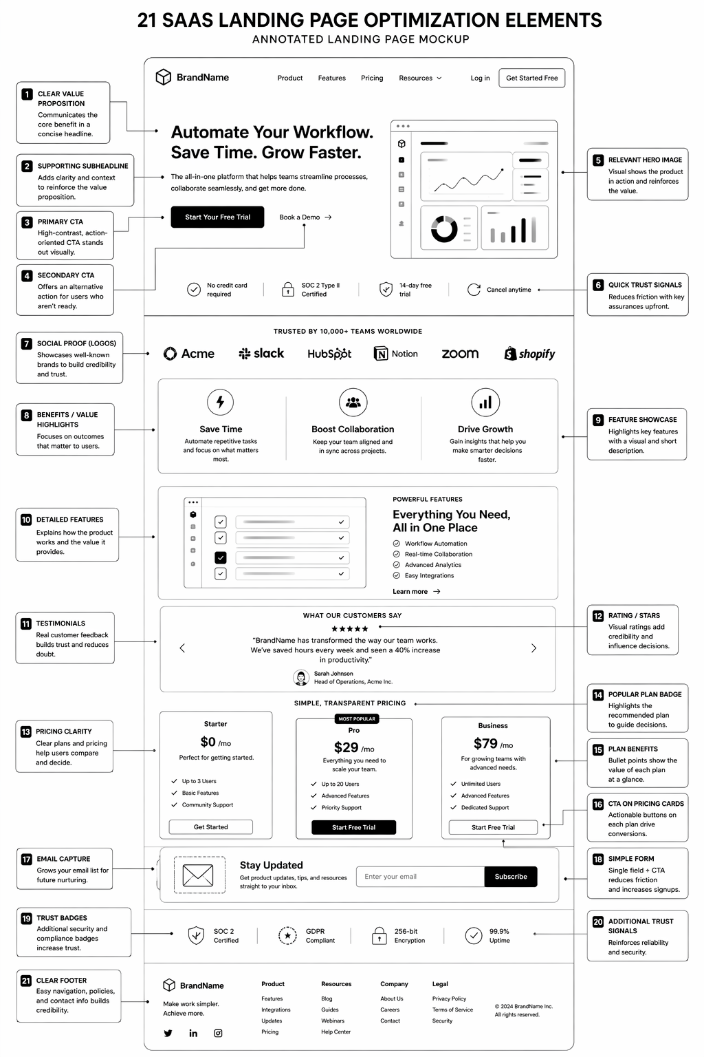
Table of Contents
Most SaaS landing page content online is recycled tactics from 2019. “Add social proof.” “Use power words.” “FOMO sells.” None of that moves modern B2B buyers in 2026.
This is what actually converts on SaaS landing pages now. 21 specific patterns, placements, and micro-copy changes that move qualified demo requests 20–40%. Not theory, not trends. Real tactics on real campaigns.
The 21 Tactics That Move SaaS Landing Pages
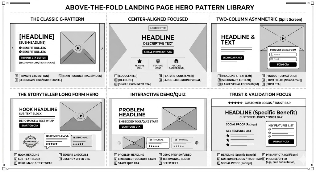
Hero Section (Tactics 1–4):
1. Lead with specific outcome, not product name. “Reduce customer churn by 25% using AI-powered predictive analytics” beats “Meet ChurnAI.” Outcome first, product second. Moves visitors from “what is this?” to “do I need this?” instantly.
2. Sub-headline should answer “for whom?” “Built for B2B SaaS leaders managing 100–1,000 customers” beats generic “for every business.” Micro-segmentation increases relevance and qualification.
3. Call-to-action button changes copy by audience segment. Known visitors see “Start free trial.” Unknown visitors see “See how it works.” Decision-stage changes copy. Use dynamic CTA when possible.
4. Trust bar above the fold (not below). Customer logos, certification badges, review scores visible in hero. Not at bottom of page. Removes objection before they scroll.
Social Proof (Tactics 5–8):
5. Named customers + specific results. “Acme Corp reduced onboarding time from 4 weeks to 5 days” beats “Trusted by 500+ companies.” Specificity builds trust faster than numbers.
6. Review aggregators displayed early and prominently. G2 verified badge, Capterra score, Trust Radius ranking. Third-party validation carries more weight than self-reported testimonials.
7. Customer testimonial includes use case and metric. “We use this for sales forecasting. Accuracy improved 30%” beats “Great tool, highly recommend.” Metric-backed testimonials move SaaS buyers.
8. Competitive comparison testimonials (use cautiously). “Switched from [competitor]. This is 3x faster and 50% cheaper” moves technical buyers. Use sparingly and only with true comparisons.
Form and CTA Placement (Tactics 9–12):
9. Form right-side, not bottom-of-page. Visible on viewport without scrolling (on desktop). Right-side converts 20–30% better than below-the-fold. Mobile: consider embedded form mid-page instead.
10. Form fields reduced to 3–4 maximum. Every field reduces conversion 10–15%. If you need 10 fields, ask them later post-signup. Friction earlier usually means no conversion.
11. CTA button copy matches commitment level. “Get demo” for high-touch. “Start free trial” for self-service. “See pricing” for browsers. Copy should reflect actual next step.
12. Qualifying question in form (before they submit). “What’s your current annual recurring revenue?” Answers self-select who converts. Garbage-in-garbage-out on leads, but higher-quality respondents overall.
Value Prop and Objection Handling (Tactics 13–17):
13. Objection-handling section (near CTA). “How is this different from [competitor]?” answered in a single sentence. “When can I get started?” answered explicitly. Removes friction from buying.
14. Feature bullets speak to problem, not feature. “Reduces cycle time” beats “Sales forecasting module.” Problem-to-solution language converts better than feature-to-benefit language.
15. Use case or vertical segmentation visible early. Pharma, fintech, SaaS buttons that show use-case-specific value. Buyers want to see themselves reflected, not generic positioning.
16. Security and compliance badges on form section. SOC 2 badge, HIPAA certified, GDPR compliant. Enterprise buyers need this visible before they’ll enter email.
17. Pricing anchor (if not on separate page). “From £99/month” visible, even if full pricing is elsewhere. Removes sticker shock and lowers barrier to inquiry.
Scarcity and Momentum (Tactics 18–21):
18. Real scarcity (not fake). “Only 5 spots left this month for setup consultation” works if true. Fake scarcity backfires when discovered. Use real scarcity or don’t use it.
19. Social proof of momentum. “500+ companies launched this month” or “Added 20 Fortune 500 companies this year” speaks to growth, not just adoption.
20. FAQ section answers top objections. Not generic “how much?” but “how long to see ROI?” and “can I cancel anytime?” Real questions prospects ask, not theoretical.
21. Personal note or credibility signal from founder/CMO. “Hey, I’m [name], we built this because…” humanises the page and builds trust. Optional, but effective on high-touch pages.
Testing Framework: What to Test First
High impact, low effort: Tactics 1–2 (headline/sub), 4 (trust bar above fold), 10 (form field count), 11 (CTA copy).
Medium effort, high impact: Tactics 3 (dynamic CTA), 5–7 (social proof specificity), 13–14 (objection handling, feature bullets).
Lower priority: Tactics 18–21 (scarcity, FAQ, founder note) are validating, not core to conversion.
Want a free teardown of your SaaS landing page? Our CRO team analyzes high-traffic pages and identifies your top 3 quick wins. Book a landing page audit.
FAQ
What’s a good demo request conversion rate for SaaS landing pages?
2–5% for awareness-stage traffic. 5–15% for intent-driven traffic. If you’re below 2%, something structural is broken.
Should my landing page be long or short?
Long (3,000+ words) works for complex, high-ticket products. Short (500–800 words) works for simple, self-serve products. Test both; measure time-on-page and bounce rate.
Can I test these 21 tactics all at once?
No. Test 1–2 tactics per cycle. Measure for 2 weeks minimum. Compound small wins beat big overhauls.
What’s the fastest way to improve landing page conversion?
Fix form field count (Tactic 10). Reduce from 8 fields to 3 fields. Conversion usually lifts 15–25% within 1 week.
Should I hire a landing page specialist?
For mission-critical landing pages, yes. For experimentation, in-house works if you have CRO literacy. Most companies benefit from expert eyes at least once.
Conclusion: Landing Pages Compound Over Iterations
The best SaaS landing pages aren’t the result of one big redesign. They’re the result of 12+ monthly iterations, each tactically grounded in data.
Start with tactics 1–11. Measure. Iterate. You’ll reach 8–12% demo request conversion within 90 days if you stay disciplined.
Our CRO team runs landing page audit and builds programmes for SaaS companies. Book a teardown if you want expert guidance on your specific page.
The SaaS Landing Page Teardown Template
— an audit framework to evaluate any landing page against all 21 tactics.