 Website Designing
 Web Development
 Mobile Applications
 Marketing
 CMS & Ecommerce
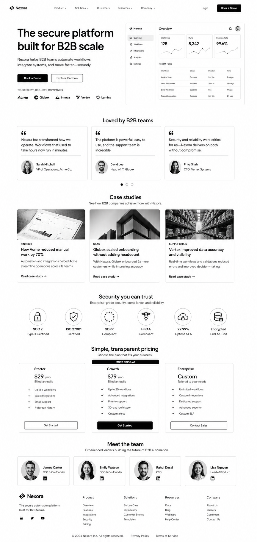
Table of Contents
B2B websites fail because they’re designed for individual buyers. But B2B purchases aren’t individual. They’re committees. 11 people reviewing the decision. Finance, procurement, operations, security, and business buyers all asking different questions.
This guide covers UX patterns that address a committee, not a person. Trust signals that matter in longer sales cycles. Page layouts that answer 11 different questions on one page. Practical patterns for B2B sites that actually move enterprise deals.
B2B Decision-Making: The UX Reality
The buyer who lands on your site is rarely the decider. They’re the initiator. Five other people will review before a buying decision happens. Your site has to answer questions for:
- Business buyer: “Does this solve our problem and improve metrics?”
- Finance: “Is this within budget and what’s the ROI?”
- Procurement: “What’s the contract, SLA, and support?”
- Operations/IT: “Can we integrate this? How much work?”
- Security: “Is this secure? Compliant? Who has access?”
Your UX has to make all five questions answerable in 5 minutes, not buried in docs.
The B2B UX Patterns That Convert
1. Hero section shows business outcome, not feature list. “Reduce customer churn by 25%” beats “AI-powered churn prevention.” Every enterprise buyer answers: “Does this help our metrics?”
2. Below hero: immediate proof of viability. Security badges (SOC 2, ISO 27001), compliance (HIPAA, GDPR), certifications visible within first viewport. Security buyers check this before they scroll.
3. “Featured customers” section with logos + specific results. Not “Trusted by 500+.” Show: “Acme Corp (Fortune 500) reduced churn 30%.” Names and metrics matter more than volume.
4. Integration/compatibility section explaining “how it fits.” “Works with: Salesforce, HubSpot, Marketo…” Operations teams evaluate this early. Make it obvious, not buried.
5. Case study section with quantified results per role. One case study told three ways: “Business impact: +40% conversion.” “IT impact: 2-hour integration.” “Finance impact: ROI in 6 months.” Different stakeholders read different sections.
6. Transparent pricing (or honest “let’s talk pricing”). Enterprise usually requires custom contracts, but show a starting price or clear explanation. Hidden pricing kills trust with procurement.
7. FAQ section answers implementation questions. Not generic “how do I sign up?” but “What’s the typical implementation timeline?” “Can I cancel anytime?” “What training is included?” Real concerns.
8. Contract and security documentation linked (not hidden). SOC 2 report, DPA, standard contract visible. Security teams will find these anyway. Hiding them signals something’s wrong.
9. Reference customer section with names/LinkedIn profiles. “Ask me how” buttons with contact info. Finance and procurement want to call existing customers. Make this easy.
10. Implementation timeline explicit and realistic. “Go-live in 2 weeks for core product, 6 weeks fully integrated with your stack.” Operations buyers need to know the work window.
Trust Signals That Matter in B2B
B2B buyers have different trust criteria than consumers:
- Verified certifications (SOC 2, ISO 27001) beat “we’re secure.”
- Named reference customers beat “trusted by enterprises.”
- Case studies with named customers beat anonymized results.
- Documented SLAs and support terms beat vague “24/7 support.”
- Third-party reviews (G2, Capterra) beat self-reported testimonials.
- Team bios with credentials beat faceless company names.
- Published roadmap beats “coming soon” features.
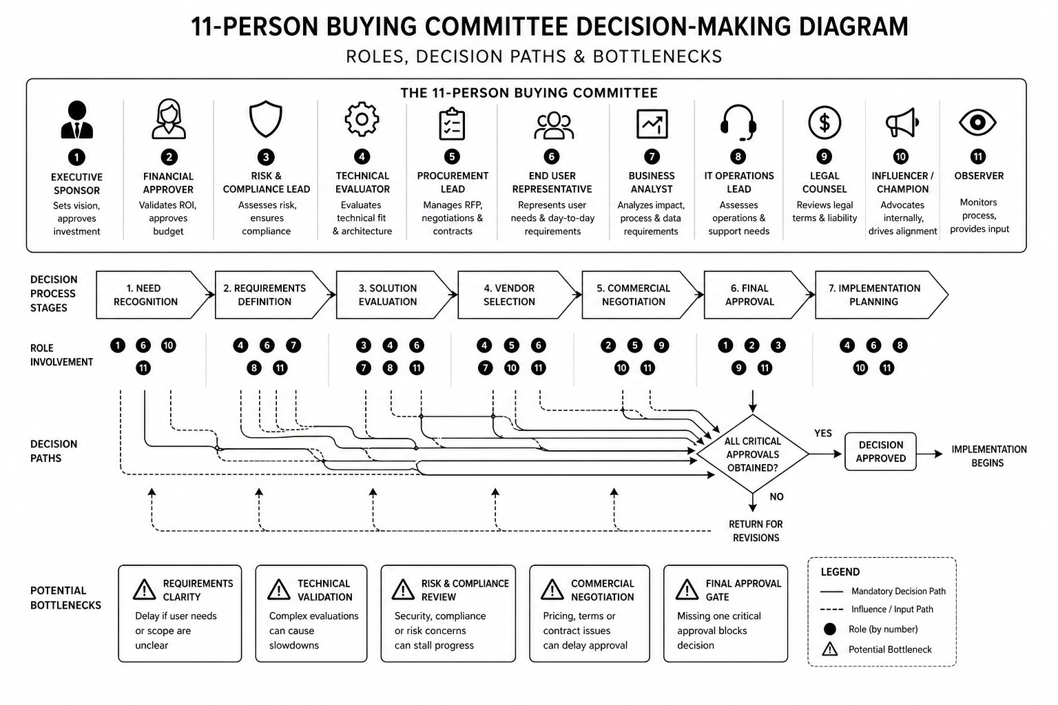
Layout Pattern That Answers All 11 Questions
Section order that works:
- Hero + value prop
- Trust/security badges
- Named customer logos + results
- Use case / vertical segmentation
- Feature overview (linked to implementation docs)
- Integration/compatibility
- Case studies (told multiple ways)
- Pricing (transparent or clear process)
- FAQ section (implementation, security, support)
- Security/compliance documentation links
- Reference customer contact options
- CTA section (demo + sales contact)
This pattern isn’t consumer-friendly or short-form. It’s 4,000+ words. B2B sites longer than 2,000 words often convert better than short sites.
Redesigning your B2B website and want expert guidance on conversion design? Our design team specialises in B2B. Book a discovery call.
FAQ
Should my B2B site be long or short?
Long. Enterprise buyers need comprehensive information. 3,000–5,000 words is standard. Short sites under 1,000 words usually leave money on the table.
Can I use consumer design patterns for B2B?
No. Minimalist, short-copy, high-image websites work for B2C. B2B buyers need comprehensive information architecture and trust signals. Different discipline entirely.
How do I know what questions our buying committee is asking?
Talk to 5 customers who bought and 5 who didn’t. Ask each role (finance, IT, procurement) what convinced or didn’t convince them. Design for those specific questions.
Should I hire a B2B UX specialist?
If your B2B website is a growth engine, yes. B2B UX is a specialist discipline. Generalist designers often miss the committee buying pattern.
How do I measure B2B website success?
Demo requests (not pageviews). Average sales cycle time (shorter is better). Lead quality score (fewer disqualified early). Website-sourced revenue (not leads, actual closed deals).
Conclusion: B2B UX Solves for Committees, Not Consumers
The best B2B websites aren’t the prettiest. They’re the most comprehensive. They answer 11 different questions on the same page. They build trust through transparency, not hype. They make reference calls easy and security documentation obvious.
Design for your committee, not your persona. You’ll convert more enterprise deals.
Our B2B UX team redesigns enterprise websites for SaaS and B2B brands. Book a consultation if you want expert eyes on your current site.
The B2B UX Pattern Library
— templates for each pattern mentioned above, ready to adapt for your product.