Tag Archives: saas

SaaS UI/UX Design: Principles That Convert in 2026

Most SaaS UI/UX design articles confuse aesthetics with UX. A clean interface with good spacing isn’t UX. UX is whether a user activates in 10 minutes or 10 days. Whether they expand into a seat-based plan or churn at month 4. Whether they invite their team without being asked.

This guide is for founders, heads of product, and design leads who need their SaaS product to do the heavy lifting in a market where sales cycles are longer, buyers are more skeptical, and every trial is one bad onboarding away from a cancelled credit card. These are the 2026 UX principles that move activation, retention, and expansion — not Dribbble screenshots.

What SaaS UX Actually Is

SaaS UX is the design of every touchpoint where a user meets your product — from landing page through signup, onboarding, core workflows, settings, billing, and offboarding. Good SaaS UX has three observable outcomes:

  • Time-to-first-value shrinks. The user hits the “aha” in minutes, not sessions.
  • Activation rate rises. More trials convert. More free plans upgrade.
  • Support tickets drop. Clear UX is cheaper support.

Design polish is table stakes in 2026. The differentiator is how quickly your product reveals its value and how little friction sits between the user and the job they hired you for.

Why SaaS UX Matters More in 2026

1. PLG is the default motion. Even enterprise-led SaaS now runs product-led trials and self-serve signup. The product has to sell itself inside the first session, not after a CSM call.

2. Buyers evaluate faster. The average B2B buyer evaluates 4–6 tools before choosing one. Your product has maybe 15 minutes to prove value. Bad onboarding and you’re cut from the shortlist.

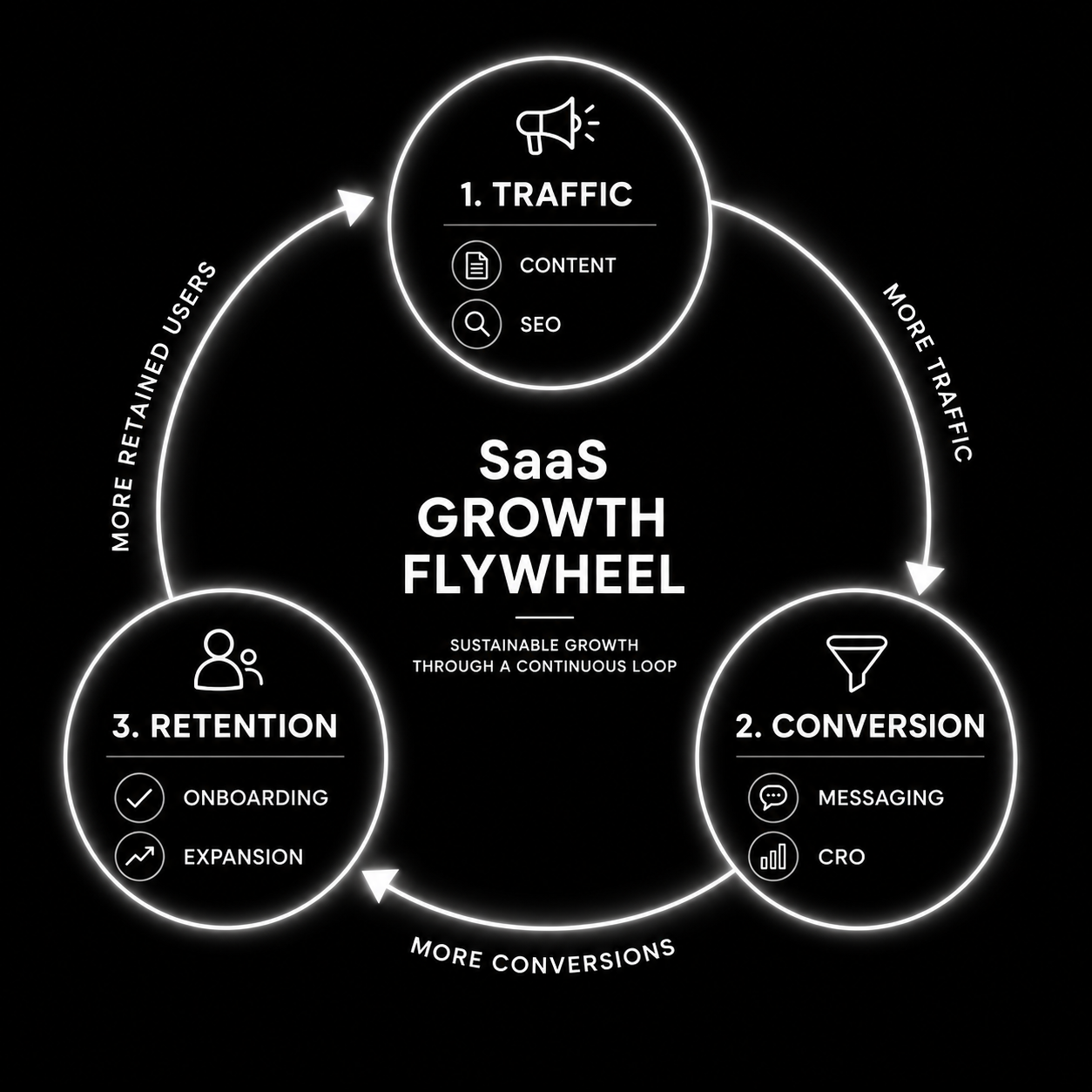
3. Retention is the only growth left. CAC is up, budgets are tight, and expansion revenue is where healthy SaaS companies grow in 2026. UX is the retention and expansion engine — not marketing.

How Good SaaS UX Works (The 8 Principles That Drive Numbers)

1. Clarity over cleverness

Every screen answers “what is this, why am I here, what do I do next” in under three seconds. Clever copy and ambiguous icons cost conversion. Name buttons literally. Label sections with the user’s language, not yours.

2. Time-to-value is a design metric

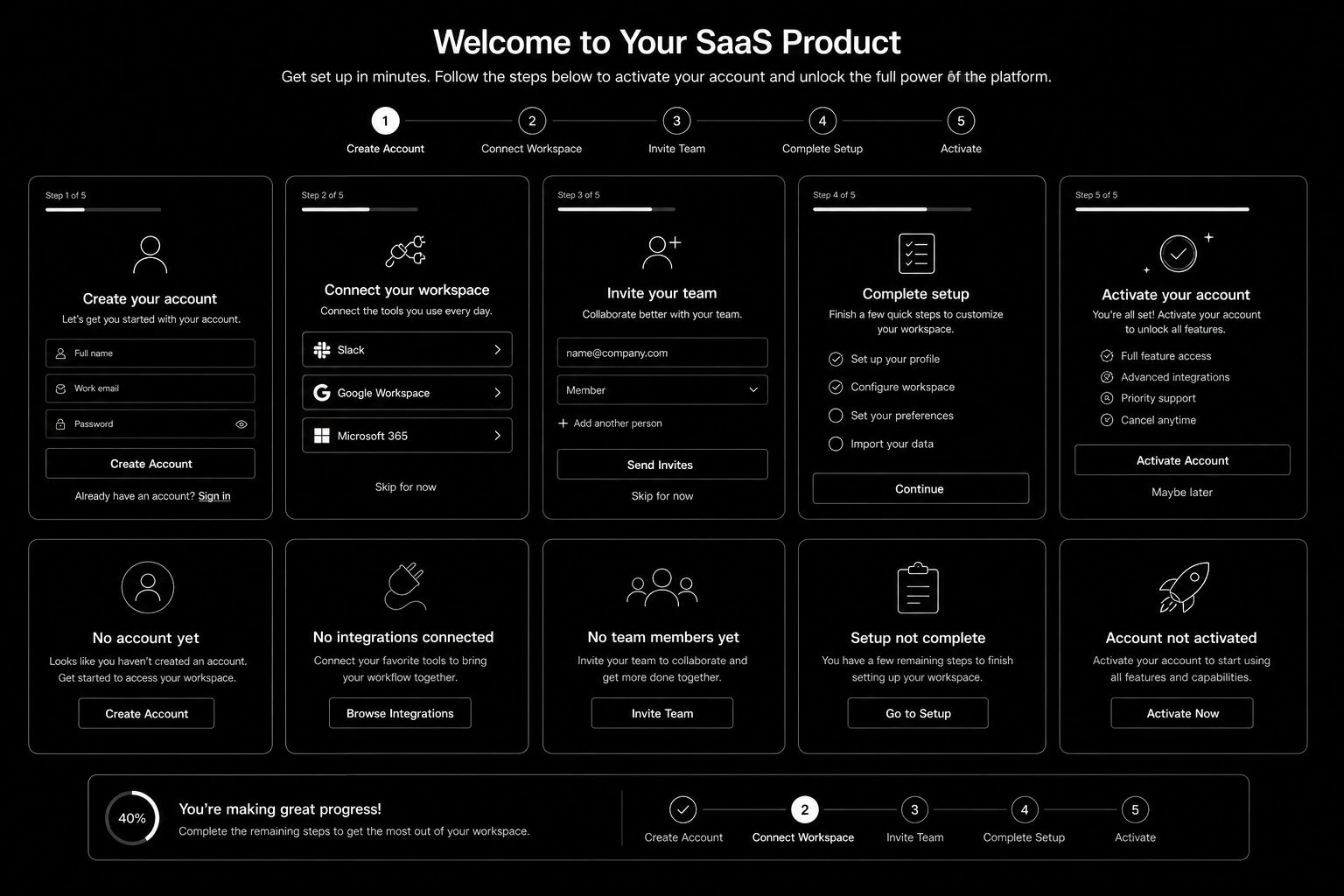
Measure how long it takes a new signup to complete the action that correlates with retention. Design every flow to shrink that number. Pre-fill. Skip steps. Offer sample data. Remove setup that can wait.

3. Progressive disclosure

Show only what the user needs right now. Advanced settings, integrations, and power features stay collapsed until the user reaches for them. Overwhelm kills activation.

4. Contextual help, not documentation dumps

Inline hints at the point of action beat a linked knowledge base. If users are clicking “Help” frequently, the UX is broken — not the docs.

5. Trust-building at every friction point

Pricing pages, upgrade prompts, and data-entry forms are trust moments. Social proof, security badges, money-back reminders, and plain-language microcopy reduce drop-off at these points more than any redesign.

6. Performance is UX

Every second of load time costs conversion. SaaS dashboards with 3+ second interactions lose active users. Instrument Time-to-Interactive (TTI) and Interaction-to-Next-Paint (INP) on your core workflows.

7. Lifecycle-aware design

New users need a different product than power users. Default to sensible “new user” state, graduate to advanced as usage matures. Paywalls, upgrade prompts, and expansion CTAs trigger on behaviour, not calendar.

8. Cross-platform consistency

Marketing site, signup, product, email, mobile, and support channels need a shared design system. Visual and behavioural consistency is a trust signal. Our UI/UX design team treats this as a single system, not three disciplines.

Step-by-Step: Auditing Your Current SaaS UX

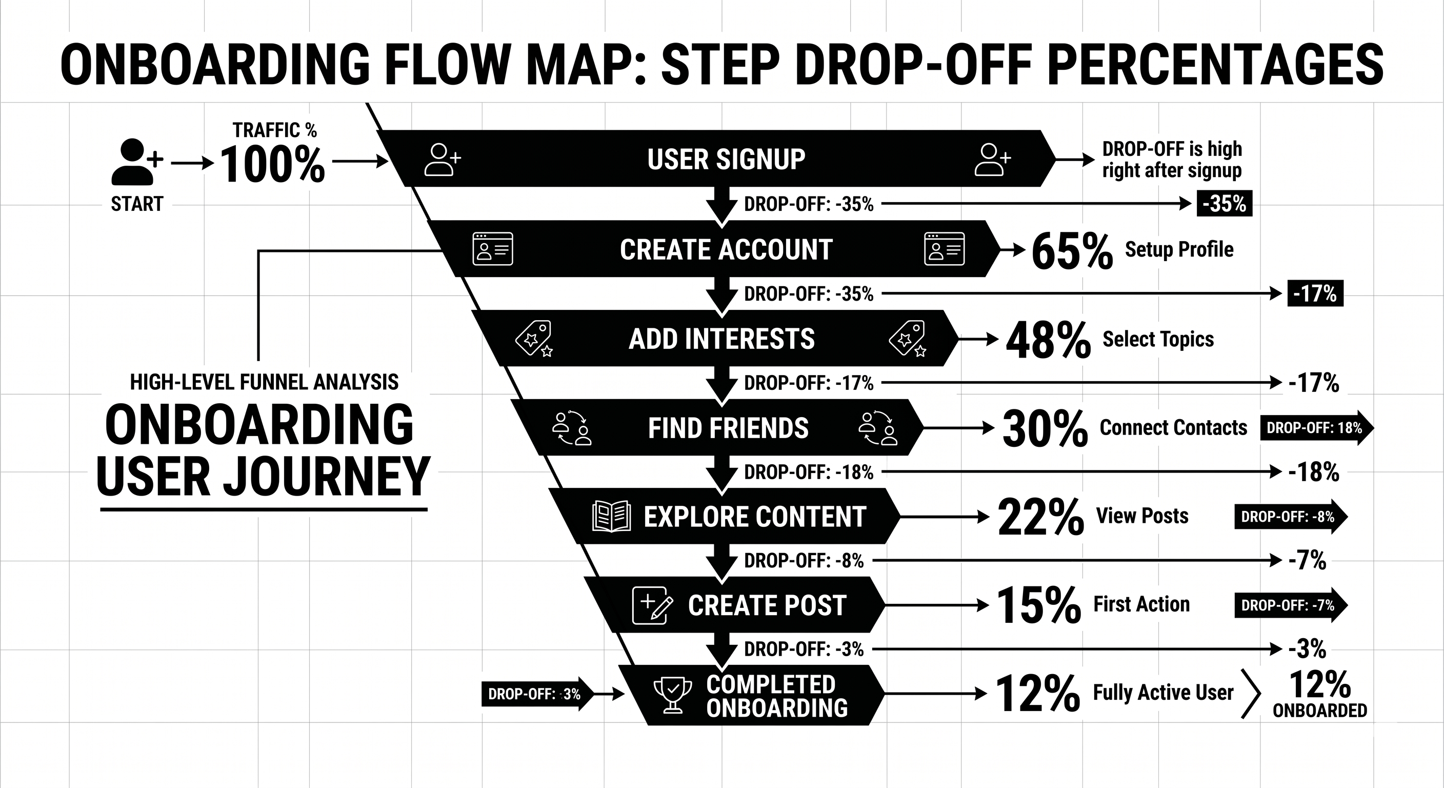
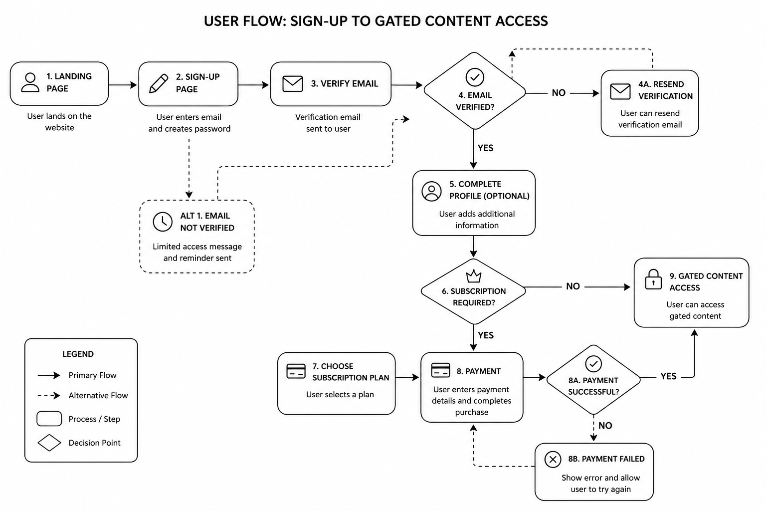
Step 1 — Run a time-to-value test. Watch 10 new users sign up, without intervention, and time how long it takes each to reach your core “aha” moment. The gap between your best and worst case is your opportunity.

Step 2 — Session replay review. Pull 20 sessions from new signups. Tag every moment of confusion, rage click, or abandonment. Cluster by root cause.

Step 3 — Support ticket audit. Top 10 recurring tickets over the last 60 days. Every one of them represents a UX failure, not a user problem.

Step 4 — Funnel instrumentation. Signup → activation → retention → expansion. Each stage broken into micro-steps with drop-off measured. You cannot fix what you cannot see.

Step 5 — Prioritised redesign backlog. Everything above becomes a scored backlog. Fix the biggest drop-off first. Ship small, measure, iterate.

Your product UX is probably costing you 15–30% of activation you could capture. Our product design team runs free 45-minute SaaS UX audits — we’ll walk your onboarding and show you the three biggest leaks specific to your product. Book a UX audit.

Best Tools for SaaS UX in 2026

  • Figma — Still the design tool. Variables, auto layout, and dev mode are non-negotiable in 2026.
  • Fullstory, Hotjar, or Microsoft Clarity — Session replay. Clarity is free and good.
  • Amplitude or Mixpanel — Funnel analytics, retention curves, feature adoption.
  • Userpilot, Appcues, or Chameleon — In-product onboarding and contextual hints.
  • Sprig or Dovetail — Qualitative research and in-product surveys.
  • Storybook — Component library for engineering-design sync.
  • Maze or UserTesting — Remote usability testing at scale.
  • Linear + Notion — Design-to-engineering handoff and research documentation.

If you’re running a B2B website alongside the product, pair these with our B2B UX design guide for the marketing side.

Common SaaS UX Mistakes

1. Redesigning for the team, not the user. Leadership wants a “fresh look.” Designers ship a refresh that doesn’t change the numbers. Fix: anchor every redesign to a measurable outcome (activation, retention, expansion).

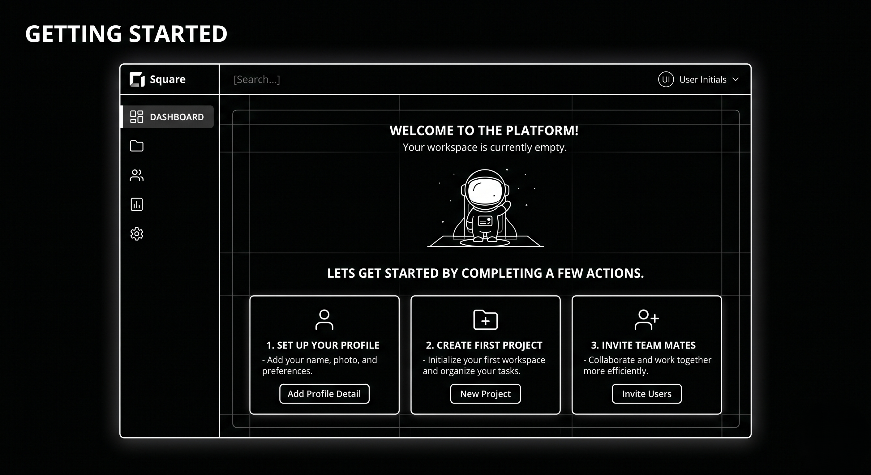
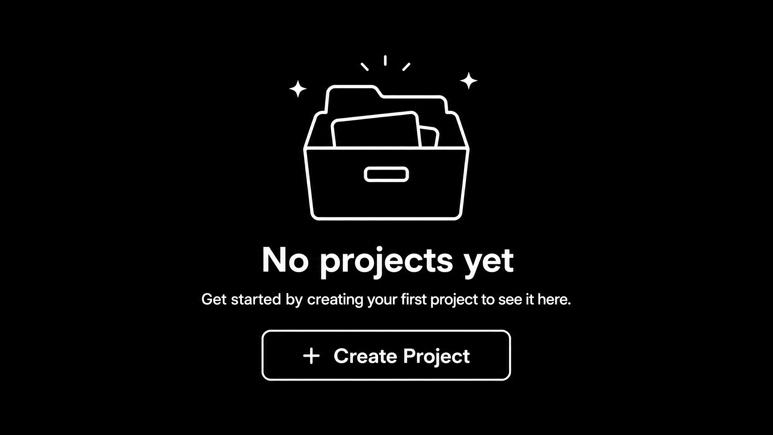
2. Empty states that aren’t empty states. New users land in a blank dashboard with no direction. Fix: sample data, guided first action, celebratory moment at completion.

3. Feature dumping in onboarding. 8-step product tour nobody finishes. Fix: one action, one value moment. Rest of the product reveals itself contextually.

4. Dark patterns at upgrade. Hiding cancel buttons, forced account call-to-cancel. Short-term retention lift, long-term reputation damage. Don’t.

5. Marketing site and product feel like two different companies. Buyer converts on a polished marketing site, signs up, and meets a 2019 dashboard. Fix: unified design system across marketing and product.

6. No instrumentation. Design ships, nobody measures what happened. Fix: every major UX change gets a measurement plan before launch.

FAQ

What’s the difference between UI and UX in SaaS?

UI is the visual interface — typography, spacing, colour, components. UX is the broader system — flows, friction, time-to-value, retention behaviour. UI is a subset of UX. Great UI with broken UX still loses.

How much does SaaS UI/UX design cost?

Retainer with a specialist product design agency: £8–25k/month. Single project redesign: £25–100k depending on scope. In-house senior product designer: £80–140k/year fully loaded.

How do I measure if UX improvements are working?

Three metrics: activation rate (did new signups complete the key action), time-to-value (how long did it take), and 30-day retention. Design changes that don’t move these are cosmetic.

Should I use a design system?

Yes, past about 20 components. Design systems save 40–60% of future design and engineering time. Tailwind, shadcn/ui, or a custom token-driven system are standard starting points in 2026.

How often should SaaS UX be updated?

Continuous, not cyclical. Major redesigns every 3–4 years. Component-level and flow-level updates shipping monthly in a healthy product.

Do I need a specialist SaaS UX agency?

For PLG SaaS, yes — generalist agencies rarely understand activation, expansion, and lifecycle-driven design. Our team works exclusively with SaaS and B2B clients, so the patterns and pitfalls are familiar.

Conclusion: UX as the Quiet Growth Lever

UX doesn’t make headlines like a new product launch or a viral campaign, but it’s the lever that quietly determines whether your growth model compounds or leaks. The SaaS companies growing healthily in 2026 have made product design a first-class revenue function, not a polish phase at the end of engineering.

If your activation, retention, or expansion numbers are softer than they should be, the answer is rarely another feature. It’s clearer flows, faster time-to-value, and design that respects what the user came to do.

Our product design team works with SaaS companies in the UK and USA to diagnose and fix UX leaks that cost real revenue. Book a free UX audit — 45 minutes, and we’ll show you exactly where your product is leaking users.


The SaaS Onboarding UX Audit Template
— the Notion template we use on every client audit to map funnel drop-off, friction points, and prioritised fixes.

That’s enough scrolling for now – chat to a WordPress Expert today!

Contact Us

SaaS Website Growth Strategy: Turn Your Site Into a Lead Engine

Most SaaS marketing sites are digital brochures. Beautiful, yes. Strategic? No. They sit at the top of the funnel, generate a few qualified leads per month, then rely on paid ads and outbound to fill pipeline.

The top 10% of SaaS websites are built as compounding systems. Content attracts organic traffic. Layout and copy convert visitors to qualified leads. Onboarding and activation convert trials to paying customers. Each loop feeds the next. Year-over-year, the machine gets more efficient, not less.

This guide covers how to shift your site from brochure to lead engine. The three loops. The metrics that matter. How to prioritise.

The Three Loops of a SaaS Growth Flywheel

Loop 1: Traffic Loop (Content + SEO)

Publish topical content clusters around primary keywords. Each blog post links to product pages. Each product page links to related blogs. Internal link structure compounds. Organic traffic grows month-over-month without paid spend.

Metrics: +10–20% organic traffic per quarter is achievable with consistent content. Better if you’re starting from low baseline.

Tools: Semrush, Ahrefs for keyword research. Content management system with editorial SEO tools. See our CRO playbook for content strategy.

Loop 2: Conversion Loop (Messaging + CRO)

Visitors arrive. Layout, copy, and CTA clarity convert them to qualified leads. Not all traffic is equal. Organic traffic from high-intent keywords converts 3–5x better than paid traffic from cold audiences.

Metrics: +0.5–2% conversion rate improvement per quarter is achievable. Compounded over 12 months, that’s 20–30% lifetime improvement.

Tools: Hotjar or Clarity for session recording. Figma for design iteration. Analytics tools to segment traffic by source and intent.

Loop 3: Retention Loop (Onboarding + Expansion)

Customer signs up. Onboarding and activation direct them to first value. Early success triggers expansion moment. Existing customer reaches for upsell. Customer lifetime value increases. Word-of-mouth and referrals bring inbound interest.

Metrics: +10% retention month-over-month on a cohort. +5–10% expansion revenue per paying customer annually. 20–30% of new customers from referral/word-of-mouth.

Tools: Product analytics (Amplitude, Mixpanel). Email marketing (HubSpot, Klaviyo) for lifecycle campaigns. In-product messaging (Appcues, Userpilot) for onboarding nudges.

The Three-Phase Roadmap

Phase 1 (Months 1–3): Foundation

  • Audit current website. What converts? What doesn’t?
  • Lock positioning and messaging. Consensus on value prop.
  • Build content calendar for 12 months (pillar + supporting content).
  • Implement basic CRO (form field reduction, CTA clarity).

Phase 2 (Months 4–9): Acceleration

  • Publish 8–12 high-quality posts (one per week).
  • Build content cluster linking structure.
  • Ship 3–5 CRO experiments per month.
  • Instrument product for onboarding + conversion tracking.

Phase 3 (Months 10–12): Compounding

  • Content traffic reaches 50%+ of total visits.
  • Conversion rate improved 20–30% from baseline.
  • Onboarding and expansion workflows live.
  • Referral loop producing 15–25% of new customers.

Common Mistakes That Slow Growth Loops

1. No content strategy. Publishing randomly doesn’t build traffic. Fix: pillar/cluster strategy with 12-month roadmap.

2. Slow CRO iteration. One A/B test per quarter doesn’t move numbers. Fix: 3–5 experiments per month, measure ruthlessly.

3. Product not optimised for conversion. Website drives leads. Product doesn’t activate them. Onboarding leaks 40%. Fix: instrument product, run onboarding experiments.

4. No expansion motion. Customer signs up, gets value, stays flat. No upsell, no expansion, no referral trigger. Fix: map expansion workflow, ship lifecycle campaigns.

5. Paid ads as a crutch. Heavy paid ad spend masks broken organic. Fix: organic foundation first, paid as accelerant later.

For the full conversion optimization playbook, see the CRO playbook. For SaaS landing page specifics, see SaaS landing page optimization.

Ready to build a SaaS growth flywheel? Our growth strategy team maps the three loops for your business and prioritises Phase 1. Book a strategy call.

FAQ

What’s a realistic timeline to see results from a growth flywheel?

Phase 1 (foundation): 3 months, minimal visible change. Phase 2 (acceleration): 6 months, 2–3x traffic improvement and 20% conversion lift. Phase 3 (compounding): 12+ months, 10x traffic, 3x leads, real referral engine.

Should I hire an agency for this or do it in-house?

Hybrid works best: agency builds strategy and trains team, team executes and iterates. Pure in-house works if you have content + CRO + product analytics depth. Pure agency usually costs more and moves slower.

What’s the fastest way to see results?

Conversion optimization (Loop 2). A 2% conversion rate improvement shows in the same month. Content (Loop 1) takes 3–6 months to show. Start with quick CRO wins while content seasons.

How do I measure if my growth flywheel is working?

Track monthly: organic traffic, demo requests, qualified leads, trial signups, paying customers, LTV. You should see each increase 15–25% month-over-month if loops are tight.

Can I build a growth flywheel without a dedicated content team?

Yes, if you repurpose founder/product leader content and outsource writing. But consistency matters. One post per week beats five posts per month. Sustainable pace beats sporadic output.

Conclusion: Flywheels Beat Ad Spend

The SaaS companies growing fastest in 2026 aren’t the ones with the biggest ad budgets. They’re the ones with the tightest flywheels. Content attracts. Conversion takes. Product activates. Expansion drives. Loop repeats. More efficient every cycle.

Build the flywheel. It takes 12 months. By month 18, you have a customer acquisition machine that works with zero paid ads.

Our growth strategy team builds SaaS flywheels. Book a strategy call if you want expert roadmapping.


The SaaS Website Growth Playbook
— the full 90-day roadmap for launching your three-loop flywheel with content, CRO, and onboarding milestones.

That’s enough scrolling for now – chat to a WordPress Expert today!

Contact Us

Landing Page Optimization for SaaS: 21 Tactics That Actually Work

Most SaaS landing page content online is recycled tactics from 2019. “Add social proof.” “Use power words.” “FOMO sells.” None of that moves modern B2B buyers in 2026.

This is what actually converts on SaaS landing pages now. 21 specific patterns, placements, and micro-copy changes that move qualified demo requests 20–40%. Not theory, not trends. Real tactics on real campaigns.

The 21 Tactics That Move SaaS Landing Pages

Hero Section (Tactics 1–4):

1. Lead with specific outcome, not product name. “Reduce customer churn by 25% using AI-powered predictive analytics” beats “Meet ChurnAI.” Outcome first, product second. Moves visitors from “what is this?” to “do I need this?” instantly.

2. Sub-headline should answer “for whom?” “Built for B2B SaaS leaders managing 100–1,000 customers” beats generic “for every business.” Micro-segmentation increases relevance and qualification.

3. Call-to-action button changes copy by audience segment. Known visitors see “Start free trial.” Unknown visitors see “See how it works.” Decision-stage changes copy. Use dynamic CTA when possible.

4. Trust bar above the fold (not below). Customer logos, certification badges, review scores visible in hero. Not at bottom of page. Removes objection before they scroll.

Social Proof (Tactics 5–8):

5. Named customers + specific results. “Acme Corp reduced onboarding time from 4 weeks to 5 days” beats “Trusted by 500+ companies.” Specificity builds trust faster than numbers.

6. Review aggregators displayed early and prominently. G2 verified badge, Capterra score, Trust Radius ranking. Third-party validation carries more weight than self-reported testimonials.

7. Customer testimonial includes use case and metric. “We use this for sales forecasting. Accuracy improved 30%” beats “Great tool, highly recommend.” Metric-backed testimonials move SaaS buyers.

8. Competitive comparison testimonials (use cautiously). “Switched from [competitor]. This is 3x faster and 50% cheaper” moves technical buyers. Use sparingly and only with true comparisons.

Form and CTA Placement (Tactics 9–12):

9. Form right-side, not bottom-of-page. Visible on viewport without scrolling (on desktop). Right-side converts 20–30% better than below-the-fold. Mobile: consider embedded form mid-page instead.

10. Form fields reduced to 3–4 maximum. Every field reduces conversion 10–15%. If you need 10 fields, ask them later post-signup. Friction earlier usually means no conversion.

11. CTA button copy matches commitment level. “Get demo” for high-touch. “Start free trial” for self-service. “See pricing” for browsers. Copy should reflect actual next step.

12. Qualifying question in form (before they submit). “What’s your current annual recurring revenue?” Answers self-select who converts. Garbage-in-garbage-out on leads, but higher-quality respondents overall.

Value Prop and Objection Handling (Tactics 13–17):

13. Objection-handling section (near CTA). “How is this different from [competitor]?” answered in a single sentence. “When can I get started?” answered explicitly. Removes friction from buying.

14. Feature bullets speak to problem, not feature. “Reduces cycle time” beats “Sales forecasting module.” Problem-to-solution language converts better than feature-to-benefit language.

15. Use case or vertical segmentation visible early. Pharma, fintech, SaaS buttons that show use-case-specific value. Buyers want to see themselves reflected, not generic positioning.

16. Security and compliance badges on form section. SOC 2 badge, HIPAA certified, GDPR compliant. Enterprise buyers need this visible before they’ll enter email.

17. Pricing anchor (if not on separate page). “From £99/month” visible, even if full pricing is elsewhere. Removes sticker shock and lowers barrier to inquiry.

Scarcity and Momentum (Tactics 18–21):

18. Real scarcity (not fake). “Only 5 spots left this month for setup consultation” works if true. Fake scarcity backfires when discovered. Use real scarcity or don’t use it.

19. Social proof of momentum. “500+ companies launched this month” or “Added 20 Fortune 500 companies this year” speaks to growth, not just adoption.

20. FAQ section answers top objections. Not generic “how much?” but “how long to see ROI?” and “can I cancel anytime?” Real questions prospects ask, not theoretical.

21. Personal note or credibility signal from founder/CMO. “Hey, I’m [name], we built this because…” humanises the page and builds trust. Optional, but effective on high-touch pages.

Testing Framework: What to Test First

High impact, low effort: Tactics 1–2 (headline/sub), 4 (trust bar above fold), 10 (form field count), 11 (CTA copy).

Medium effort, high impact: Tactics 3 (dynamic CTA), 5–7 (social proof specificity), 13–14 (objection handling, feature bullets).

Lower priority: Tactics 18–21 (scarcity, FAQ, founder note) are validating, not core to conversion.

Want a free teardown of your SaaS landing page? Our CRO team analyzes high-traffic pages and identifies your top 3 quick wins. Book a landing page audit.

FAQ

What’s a good demo request conversion rate for SaaS landing pages?

2–5% for awareness-stage traffic. 5–15% for intent-driven traffic. If you’re below 2%, something structural is broken.

Should my landing page be long or short?

Long (3,000+ words) works for complex, high-ticket products. Short (500–800 words) works for simple, self-serve products. Test both; measure time-on-page and bounce rate.

Can I test these 21 tactics all at once?

No. Test 1–2 tactics per cycle. Measure for 2 weeks minimum. Compound small wins beat big overhauls.

What’s the fastest way to improve landing page conversion?

Fix form field count (Tactic 10). Reduce from 8 fields to 3 fields. Conversion usually lifts 15–25% within 1 week.

Should I hire a landing page specialist?

For mission-critical landing pages, yes. For experimentation, in-house works if you have CRO literacy. Most companies benefit from expert eyes at least once.

Conclusion: Landing Pages Compound Over Iterations

The best SaaS landing pages aren’t the result of one big redesign. They’re the result of 12+ monthly iterations, each tactically grounded in data.

Start with tactics 1–11. Measure. Iterate. You’ll reach 8–12% demo request conversion within 90 days if you stay disciplined.

Our CRO team runs landing page audit and builds programmes for SaaS companies. Book a teardown if you want expert guidance on your specific page.


The SaaS Landing Page Teardown Template
— an audit framework to evaluate any landing page against all 21 tactics.

That’s enough scrolling for now – chat to a WordPress Expert today!

Contact Us

AI Workflows for SaaS: 15 Automations That Drive Revenue

SaaS companies shipping AI workflows aren’t waiting for perfect. They’re shipping messy, iterative automations that return ROI inside 8 weeks. Lead scoring that learns. Churn detection that catches accounts before they fail. Expansion triggers that find upsell opportunities before the customer even knows they need them.

This guide covers 15 AI workflows already running in production at scaled SaaS companies. What each workflow does. What revenue lever it pulls. How to get started.

Lead and Demand Generation (Workflows 1–4)

1. Lead qualification scoring (AI-assisted). Combine firmographic (company size, industry, growth stage) + behavioural (email opens, website visits, demo request) into a single score. Predict which leads will close. Sales prioritises high-scoring leads. ROI: 20–30% improvement in sales efficiency.

2. Inbound lead conversation routing. Chat inquiry comes in, Claude classifies intent and urgency. Route to appropriate team (sales, support, product). Reduces response time by 50%. ROI: faster response, more conversions.

3. Personalized outreach sequencing. Combine account intent signals (website behaviour, industry, company news) with outreach. Different email sequences by buyer profile. Higher engagement than blast sequences. ROI: 2–3x higher email open rates.

4. Competitive intelligence trigger. Monitor news/LinkedIn for competitor mentions at your prospects. Auto-trigger sales outreach: “Saw you’re evaluating [competitor], we’re faster.” Early intervention in buying process. ROI: 10–15% win rate improvement.

Onboarding and Activation (Workflows 5–8)

5. Onboarding journey orchestration. New signup triggers personalized onboarding sequence based on use case. Customer A gets “operations setup” path. Customer B gets “analytics” path. 30–40% higher time-to-first-value.

6. Feature adoption nudge engine. Monitor product usage. Customer activated, but hasn’t used feature X yet? Trigger automated email or in-product nudge with tutorial. Increases feature adoption by 20–30%.

7. Support ticket auto-response and triage. Incoming support ticket → Claude summarises and suggests answer from knowledge base. If auto-response isn’t confident, route to human. Resolves 30–40% of tickets without human touch.

8. Activation milestone celebration (retention play). First successful workflow completion, first report generated, first team member invited — each triggers congratulatory message + upsell nudge. Small retention lift (5–10%) compounds over time.

Retention and Churn Prevention (Workflows 9–12)

9. Predictive churn scoring. Combine NPS scores, feature adoption drop, support ticket surge, usage decline. Assign churn risk score. High-risk accounts trigger immediate customer success intervention. Prevents 10–15% of would-be churn.

10. Win-back campaign for at-risk accounts. Churn risk detected. Trigger automated email from founder/CEO: “We saw you’re not using X feature. Let’s fix what’s broken.” Reactivates 15–25% of at-risk accounts.

11. Engagement re-scoring on inactivity. No login for 14 days, engagement score drops. Trigger “we miss you” email. No login for 30 days, trigger more aggressive win-back. Simple lifecycle automation with 10–15% recovery rate.

12. Customer health dashboard monitoring. Monitor key health indicators (usage, feature adoption, support sentiment). Combine into account health score. Red accounts immediately routed to customer success. Proactive support beats reactive fire-fighting.

Expansion and Revenue Growth (Workflows 13–15)

13. Upsell opportunity detection. Customer uses feature A heavily, hasn’t tried feature B yet (often a paid upgrade). Auto-trigger in-app messaging or email: “Since you love A, you’d benefit from B.” Drives 15–20% increase in upsell conversion.

14. Land-and-expand account mapping. Existing customer, new contact signs up from same company. Auto-detect cross-sell opportunity. Route to sales for expansion conversation. Finds 20–30% of opportunities sales team misses manually.

15. Customer success handoff intelligence. At contract renewal, AI compiles expansion recommendation package: “This account is ideal for [upsell]. Success metrics support [expansion story].” Sales walks into renewal with playbook, not guesswork. 10–15% uplift on renewal value.

Implementation Hierarchy: Start Here

Phase 1 (Weeks 1–4): Quick wins — Workflows 1 (lead scoring), 7 (support triage), 9 (churn scoring). Low complexity, high ROI. Get these live first.

Phase 2 (Weeks 5–12): Revenue-driven — Workflows 3 (outreach sequencing), 13 (upsell detection), 14 (land-and-expand). Medium complexity, highest revenue impact.

Phase 3 (Weeks 13+): Lifecycle-optimised — Workflows 5 (onboarding), 11 (engagement re-scoring), 15 (renewal intelligence). Longer development cycle but compound lift over 6 months.

Want to map which 15 workflows your SaaS company should prioritise? Our AI specialists run free workflow audits. Book one.

FAQ

Which AI workflow should SaaS companies start with?

Lead scoring (Workflow 1) or churn detection (Workflow 9), depending on bottleneck. If sales efficiency is your problem, start with scoring. If retention is bleeding, start with churn.

How long before these workflows ROI?

Quick wins (scoring, triage): 4–8 weeks. Revenue workflows (upsell, land-and-expand): 8–16 weeks. Lifecycle workflows (onboarding, health): 12–24 weeks.

What’s the cost to build these workflows?

Per workflow: £1.5k–5k depending on complexity. Tool costs: £100–500/month (n8n, Zapier, LLM APIs). Total Year 1: £30k–80k for 10–15 workflows.

Do I need an AI automation agency or can we build these in-house?

In-house works if you have engineering discipline and time. For most SaaS teams, agency is faster to first workflow. Hybrid (audit + strategy from agency, build in-house) works well.

What’s the biggest risk of AI workflows for SaaS?

Bad data in = bad decisions out. Make sure your data quality is strong before automation. Garbage lead scoring from bad CRM data wastes everyone’s time.

Conclusion: SaaS ROI Comes From Workflow, Not Model

The SaaS companies winning with AI in 2026 aren’t using fancier models. They’re using better workflows. Scoring based on real data. Churn detection on company-specific signals. Upsell triggers calibrated to their product and customer base.

Start with workflow 1, 7, or 9. Measure. Learn. Stack the next 3–4. You’ll see 20–30% improvement in sales efficiency + retention inside 90 days if you stay disciplined.

Our AI automation team builds SaaS workflows for revenue. Book a consultation to map your 15-workflow roadmap.


The SaaS AI Workflow Library
— templates for all 15 workflows with input/output examples and implementation steps.

That’s enough scrolling for now – chat to a AI Expert today!

Contact Us

Best Webflow Agencies for SaaS Startups: What to Look For

Most SaaS founders evaluate Webflow agencies on portfolio aesthetics alone. “That site looks beautiful, hire them.” Result: beautiful site, zero conversions, founder frustrated.

This guide covers what actually distinguishes tier-one SaaS Webflow agencies from tier-two or tier-three shops. Criteria that matter. Red flags. Questions to ask. Mistakes to avoid. Written for founders and marketing leaders choosing a Webflow partner.

The Mistake Founders Make

Founders evaluate Webflow agencies like they evaluate design portfolios. “Does it look premium? Yes. Hire.” The problem is that beautiful ≠ converting. A stunning site that doesn’t move your metrics is expensive visual debt, not an asset.

Good Webflow agencies for SaaS are builders who:

  • Understand SaaS buyer psychology (not consumer design trends).
  • Measure success by conversion and revenue metrics, not aesthetics.
  • Treat performance and SEO as first-class requirements, not afterthoughts.
  • Stay accountable for outcomes, not just deliverables.

Fewer agencies meet this bar than you’d expect.

What to Look for in a SaaS Webflow Agency

1. SaaS-specific case studies. Not just “we built a site.” Look for: “We built a SaaS marketing site that increased demo requests 40% in the first quarter.” Outcome-driven case studies are a differentiator.

2. CRM integration experience. SaaS sites need to connect to HubSpot, Segment, Intercom, and analytics tools cleanly. Agencies that mention integration strategy have thought this through.

3. CRO discipline. Site launches, then what? Good agencies include post-launch CRO roadmaps. Bad ones consider the project “done.”

4. SEO architecture thinking. Blog strategy, internal linking rules, content cluster mapping. If SEO is mentioned as “we’ll set up Yoast,” they’re not thinking architecturally.

5. Conversion optimization portfolio. Landing pages that convert. Demo request forms that close high. “Beautiful” sites that also move metrics. Portfolio should show both.

6. Performance obsession. Core Web Vitals are non-negotiable for SaaS sites. If the agency doesn’t proactively mention performance, they don’t prioritise it.

Red Flags That Expose Weak Agencies

  • Portfolio is 90% consumer brands or e-commerce. If they’ve never built SaaS sites, they don’t understand SaaS messaging.
  • Case studies don’t mention metrics or outcomes. They’re showing you beautiful work, not business results. Different thing.
  • “We do design and development” but no specialisation. Do they also do WordPress, Shopify, Framer? If everything is in scope, nothing is deep.
  • Website or case studies describe features, not outcomes. “Custom CMS” vs “CMS that lets your marketing team ship updates without engineering.” The second is better thinking.
  • No pricing guidance upfront. Evasiveness on cost signals custom pricing negotiation, which favours them, not you.
  • Quote is faster than a proper discovery phase. “I can quote you in a day” means they’re not researching, just templating.
  • No mention of post-launch support or retainers. Project ends at launch? That’s not a partnership.

Questions to Ask in Initial Calls

“Show us a SaaS site you built that increased qualified leads or demos. Walk us through the before/after metrics.” — Outcome focus separates specialists.

“What’s your approach to SaaS messaging and positioning? How do you handle value prop on the homepage?” — B2B buyers are different from consumers. Agencies should have a POV on this.

“Walk us through your CRO process post-launch. What experiments do you typically run? What’s the ROI?” — Post-launch thinking = partnership, not one-off project.

“Tell us about a Webflow site you built that had performance issues. How did you solve it?” — Real experience surfaces here.

“What integrations do you typically wire into SaaS sites, and what’s your philosophy on app selection?” — Good agencies have opinions. Bad ones wing it.

Portfolio Evaluation Framework

Score each agency’s portfolio on these criteria (1–5 scale):

  • 1. SaaS focus. Are the projects SaaS sites, or general web design?
  • 2. Visual quality. Do the sites look premium and on-brand?
  • 3. CMS/technical complexity. Blog? Filtering? Dynamic content? Or just static pages?
  • 4. Performance. Do the sites feel fast? Any signs of bloat or slow interactions?
  • 5. Conversion design. Are CTAs clear? Forms optimised? Trust signals visible?

Agencies with 4–5 ratings on all five dimensions are rare but worth the hunt.

Engagement Structures That Protect You

Discovery-first. Agencies that spend 2–3 weeks on discovery (strategy, audience research, competitive analysis) before design are building on research, not instinct.

Phased delivery. Strategy/design approval before build. Build phase approval before launch. Prevents big surprises.

Measurable success criteria. Before build starts: “By 90 days post-launch, we want demo requests at X and average time-on-site at Y.” Hold the agency to this.

Post-launch support. Include 4 weeks of changes and optimisations. After that, monthly retainer for ongoing CRO and updates (£1k–3k/month).

Staged payment. 25% upfront, 25% after discovery/design approval, 25% at build completion, 25% at launch. Aligns incentives.

Evaluating SaaS Webflow agencies and want a second opinion? Our Webflow team can review portfolios and proposals before you commit. Book a consultation.

FAQ

How much should a SaaS Webflow site cost?

Early-stage startup (5–10 pages): £8k–15k. Growth-stage (15–30 pages): £25k–60k. Enterprise (30+ pages, heavy integrations): £60k–150k+.

How do I know if a Webflow agency specialises in SaaS?

Case studies and references. Portfolio. Ask directly: “How many SaaS sites have you built? What were the outcomes?” Vague answers = not specialised.

Should I hire a boutique SaaS agency or a larger firm?

Boutiques (1–5 people): faster, cheaper, personalised. Larger firms (10+ people): more stable, better scaling support. For early-stage, boutiques often win on speed/cost. For scale-stage, larger firms offer more hands.

What’s the difference between a good Webflow agency and a great one?

Good builds what you ask for. Great builds what you need, then teaches you why it matters. Great agencies challenge assumptions. Good ones confirm them.

Can I hire a Webflow freelancer instead of an agency?

Yes, if you find a strong one. Risk: solo operator, no backup, limited scaling. Benefit: cheaper, faster. For mission-critical sites, agencies are safer.

Conclusion: Invest Time in Partner Selection

The quality of your SaaS website is determined as much by who builds it as by the platform itself. Spending an extra 2–3 weeks on agency vetting saves multiples in rework and delays.

Use this framework. Ask the right questions. Evaluate portfolios for outcomes, not just aesthetics. You’ll find a partner who builds sites that actually convert.

Our Webflow team specialises in SaaS startups and growth-stage companies. If you want to compare options, book a consultation.


The SaaS Webflow Agency Scorecard
— a detailed evaluation framework to rank agencies by criteria, reference call notes, and proposal strength.

That’s enough scrolling for now – chat to a Webflow Expert today!

Contact Us

Webflow Memberships and Gated Content: Complete 2026 Setup Guide

For years, the answer to “can I gate content on Webflow?” was “use Memberstack.” It worked, but it added another tool, another bill, and another point of failure. Webflow Memberships changed that — and after two years of GA maturity, it’s finally the right answer for most use cases in 2026.

This Webflow membership site guide walks through the architecture, setup steps, gated-content patterns, and the trade-offs between native Webflow Memberships and Memberstack. By the end you’ll know which one fits your project, how to wire it up, and how to scale to thousands of paying members without rebuilding.

If you haven’t built the underlying CMS yet, read the Webflow CMS tutorial first — Memberships is layered on top of CMS architecture, and a clean foundation matters.

What Are Webflow Memberships?

Webflow Memberships is a native module that lets you create user accounts, gate pages and CMS items, and integrate paid plans via Stripe. It handles sign-up, log-in, password reset, and access control without third-party tools.

You configure access in three places: page settings (gate any page to logged-in users or paid plan members), CMS Collection settings (gate dynamic content), and the Designer (show / hide elements based on auth state).

Released GA in 2023 and matured significantly through 2024–2025, the 2026 version supports paid plans, free plans, plan upgrades, and webhooks for integration with downstream tools.

Why Webflow Memberships Matters in 2026

Three reasons gated content became a serious play this year.

1. AI killed ungated thin content. Free PDFs and ebook-bait lead magnets convert worse every quarter. Substantive gated resources (calculators, video courses, communities) still convert — and warrant a real membership system.

2. The “free + paid tier” pattern is now standard for content businesses. Newsletters, courses, niche communities — most run a free tier (email gate) and a paid tier (Stripe-backed). Webflow Memberships handles both natively.

3. Memberstack’s pricing crept up. A 200-member site that cost $50/mo on Memberstack Lite in 2022 now runs $200+/mo. Native Webflow Memberships is included in CMS plans, no per-member fee.

How Webflow Memberships Works

The mental model: pages and CMS items can be public, gated to “any logged-in user,” or gated to specific paid plans. Users sign up, choose a plan (or stay free), pay via Stripe if needed, and the site dynamically gates content based on their auth state and plan membership.

The four building blocks

  • User Accounts — sign-up, log-in, profile, password reset
  • Plans — free, paid (one-time, monthly, yearly), with Stripe integration
  • Access Groups — collections of plans that can access specific content
  • Gated Pages and CMS — set per page or collection

Step-by-Step: Build a Webflow Membership Site

1. Plan your tier model first

Decide on the structure before opening Webflow. Common patterns:

  • Free + paid (most common). Email gate for free content, Stripe-backed paid tier for premium.
  • Free + Pro + Premium. Three tiers with progressive access.
  • Members-only community. Single paid tier, all content gated.
  • Course / cohort model. One-time payment for a fixed-length course access window.

2. Connect Stripe (for paid plans)

In Project Settings → Memberships → Payments, connect your Stripe account. Webflow uses Stripe Checkout for the payment flow — no PCI overhead. Set up Stripe Tax if you sell internationally.

3. Create plans

Add plans in the Memberships panel. For each plan, configure: name, price, billing cycle, trial (optional), and the access group.

4. Set up access groups

Access groups are collections of plans. Example: a “Premium Content” access group that includes both “Pro” and “Premium” plans. Then any page or CMS gated to that group is accessible to either plan.

5. Build sign-up, log-in, account, and password-reset pages

Webflow generates default versions; replace them with branded ones. Use the Memberships User Logged-In / Logged-Out states to conditionally show navigation, account menus, and CTAs.

6. Gate pages and CMS items

Per page: in page settings, set the access group. Per CMS: in collection settings, gate the entire collection or specific items via a reference field on each item.

7. Build the member dashboard

A dedicated logged-in homepage showing the user’s name (via User Account binding), their plan, their resources, and a way to upgrade or manage billing (Stripe Customer Portal link).

8. Test the full flow end-to-end

  • Sign up free → access free content, gated correctly
  • Upgrade to paid → Stripe Checkout → return to dashboard with new access
  • Cancel paid → access reverts
  • Password reset email arrives correctly
  • Webhook fires to your CRM / email tool on plan changes

9. Wire up downstream integrations

Use Webflow Logic or third-party automations (Zapier, Make) to push new members into HubSpot, ConvertKit, or your CRM. See our marketing automation guide for patterns.

Mid-article CTA → Want a specialist to architect your membership site so it scales? Book a free Webflow membership scoping call — we’ll map your tier model and integrations in 45 minutes.

Best Tools and Decisions: Native Webflow Memberships vs Memberstack

Capability Webflow Memberships Memberstack
Native Webflow integration Yes (built-in) Yes (via embed)
Pricing Included in CMS plans $50–500/mo
Stripe integration Yes Yes
Free tier Yes Yes
Custom user fields Limited Extensive
Webhooks / API Webhooks yes, API limited Full API
Custom auth flows Limited Highly customisable
Best for Standard membership and gated content SaaS-grade auth and complex flows


Native Webflow Memberships is the right answer for ~80% of projects. Use Memberstack when you need custom user metadata, advanced API integrations, or SaaS-grade auth flows that exceed native capabilities.

Common Webflow Memberships Mistakes

  • Gating too much, too early. If your free tier is thin, no one converts to paid. The paid offer needs to look obviously valuable from the free experience.
  • Forgetting password-reset and email styling. Default Webflow emails look unbranded. Customise them in Project Settings.
  • Not setting up Stripe Customer Portal. Members need a self-service way to manage billing, update cards, cancel. Stripe’s Customer Portal handles it — link from the member dashboard.
  • Skipping webhook integration. If new paid members don’t auto-flow into your CRM, your retention and engagement automation is dead on arrival.
  • Hard-coding access in custom code instead of using Access Groups. Brittle and unmaintainable.
  • Ignoring SEO on gated content. Decide whether each gated piece should be indexed (with a paywall metadata signal) or noindexed.

FAQ — Webflow Memberships

How much does Webflow Memberships cost?

It’s included in CMS, Business, and Enterprise plans at no per-member fee. Stripe takes its standard processing fee on paid plans. No additional monthly subscription beyond your Webflow site plan.

How many members can a Webflow site handle?

The current cap is 10,000 members on Business plans, higher on Enterprise. Plenty of headroom for most B2B membership sites.

Can I migrate from Memberstack to Webflow Memberships?

Yes. Export users from Memberstack, import into Webflow via the Members API. Plan password resets — passwords don’t carry across platforms.

Does Webflow Memberships support social log-in (Google, etc.)?

Not natively as of 2026. If social log-in is critical, Memberstack remains the better choice.

Can I run subscription billing through Webflow Memberships?

Yes — monthly and yearly plans via Stripe. For more complex subscription logic (proration, dunning, multiple subscription items), Stripe handles the billing logic.

Can gated content rank on Google?

Yes, with proper schema. Use the `isAccessibleForFree: false` flag in Article schema and serve the first paragraph or two to crawlers via Webflow’s preview rules. Google supports this pattern formally.

Conclusion: Memberships Is Now the Default, Not the Workaround

If you’re starting a new membership site or community in 2026, default to Webflow Memberships. The native integration, included pricing, and matured feature set make it the right call for the vast majority of projects. Memberstack is still the answer for SaaS-grade auth flows and deep API customisation — but those use cases are narrower than they used to be.

Our Webflow agency has shipped membership sites for SaaS resource libraries, course businesses, and gated communities across the UK and USA. Book a free membership site scoping call and we’ll map your tier model, integrations, and timeline in 45 minutes.

Download the Membership Site Architecture Brief — the tier-model template and integration map we use on production builds.

That’s enough scrolling for now – chat to a Webflow Expert today!

Contact Us

B2B Website Redesign Checklist: 41 Items That Protect Pipeline

B2B Website Redesign Checklist in 2026 is won by execution quality, not platform hype. Teams that perform consistently align strategy, implementation, and measurement into one operating system. This guide gives the practical framework, internal link map, and optimization cadence to do that.

Half of B2B redesigns drop pipeline within 90 days of launch. This 41-point checklist prevents that. If you want implementation help, work with B2B redesign specialists. For connected strategy, also review Website Redesign Guide and Website Redesign Cost. You can also align execution with book a free consultation for cross-functional delivery.

What B2B Website Redesign Checklist Means in Practice

A B2B website redesign checklist protects pipeline by sequencing messaging, SEO, and conversion decisions before visual implementation. Most redesign failures are migration and measurement failures, not design failures.

Why b2b website redesign Matters in 2026

1. Redesign risk is often underestimated until after launch.

2. Leadership expects pipeline impact, not only visual refresh.

3. Traffic volatility can be controlled with technical planning.

Step-by-Step Playbook

1. Capture baseline metrics

Record rankings, conversion rate, and pipeline influence pre-redesign.

2. Lock positioning and IA

Finalize messaging and page intent before high-fidelity design.

3. Build redirect plan early

Map legacy URLs and preserve authority-critical routes.

4. QA conversion journeys

Test forms, events, and CRM integrations before launch.

5. Run 90-day monitoring

Track rankings and lead quality weekly after release.

Mid-article CTA -> Need support applying this to your stack? B2B redesign call and get a scoped roadmap with timeline, owners, and KPI targets.

Tools, References, and Benchmarks

  • 41-point redesign checklist
  • Redirect map workbook
  • Post-launch KPI dashboard
  • Semantic keyword targets to distribute naturally: b2b website redesign checklist, saas website redesign, b2b website refresh

Use these references during planning and QA: Google site migration guideweb.dev Core Web Vitals guidance, and Screaming Frog documentation.

Common Mistakes That Kill Performance

  • Treating redesign as brand-only work
  • Late redirect planning
  • No post-launch accountability

FAQ – B2B Website Redesign Checklist

How long does a b2b website redesign project usually take?

Most teams can ship an initial version in 4 to 8 weeks, then improve outcomes over one quarter with a weekly optimization cadence.

Is b2b website redesign relevant for UK and US teams?

Yes. The core framework is consistent across both markets. Differences are usually compliance details, buying behavior, and GBP/USD planning.

What should we measure first for b2b website redesign?

Track one leading metric, one conversion metric, and one revenue metric so execution stays tied to business impact.

Should we run this in-house or with a specialist partner?

If your team has deep expertise and bandwidth, in-house can work. If speed and risk control matter, working with a specialist partner is usually faster.

What is the most common failure mode?

Teams skip governance after launch. Data quality drifts, process quality declines, and performance plateaus. A simple weekly operating rhythm prevents this.

Conclusion

B2B Website Redesign Checklist performs best when execution decisions are tied to measurable outcomes from day one. Use this playbook to prioritize what matters, reduce risk, and create a repeatable optimization rhythm.

Want a specialist team to accelerate delivery? Talk to B2B redesign specialists or book a consultation and we will map a practical rollout plan.

Download the B2B Redesign Pipeline Protection Checklist to implement this framework with templates and checklists.

That’s enough scrolling for now – chat to a WordPress Expert today!

Contact Us

Webflow CMS Tutorial: Build a Scalable Content Engine in 2026

Most Webflow CMS builds work beautifully — until they don’t. Around 300 to 500 items in, the cracks show: collections that should reference each other don’t, templates fork into copy-paste duplicates, and the marketing team starts asking why they need a developer to add a new content type. By the time the site has 1,500 items, a rebuild is on the roadmap.

None of that has to happen. Webflow CMS scales fine to several thousand items — but only when the architecture is right from day one. This Webflow CMS tutorial walks through the structure, references, and template patterns we use on every Webflow build at our Webflow agency, including for SaaS clients shipping 30+ blog posts a month.

If you’re new to Webflow itself, start with the Webflow development guide. If you’re optimising a CMS that’s already live, pair this with the Webflow SEO checklist for technical hygiene.

What Is Webflow CMS, Really?

Webflow CMS is a content database baked into the Webflow Designer. You define Collections (think: blog posts, case studies, team members, products), each with custom fields, and Webflow generates dynamic pages and lists from those records.

The platform’s marketing positions it as “no-code blogging.” That’s underselling it. A well-architected Webflow CMS is closer to a headless content platform with a visual frontend builder — capable of running multi-language sites, gated resource libraries, and publication-grade content hubs.

What it isn’t: a database for transactional records. CMS is built for editorial content with reasonable update frequency, not for thousands of writes per day.

The four building blocks

  • Collections — the content types (Blog Posts, Authors, Categories).
  • Fields — the columns inside each collection (title, slug, body, publish date).
  • Reference / Multi-Reference fields — the relationships between collections.
  • Collection Pages and Collection Lists — the dynamic templates that render the data.

Get those four right, and the rest is design. Get them wrong, and every change becomes a project.

Why Webflow CMS Architecture Matters in 2026

Three reasons your CMS structure decides whether the site compounds or stagnates.

1. Content velocity is now a ranking signal. Google’s helpful-content updates reward sites with ongoing publishing rhythm. If your CMS makes adding a new content type a developer ticket, your team will publish less. Less publishing means slower topical authority.

2. AI search rewards structure. Perplexity, ChatGPT search, and Google’s SGE pull from sites that expose clean structured data. A Webflow CMS with proper reference relationships outputs cleaner JSON-LD and gets cited more often.

3. Editorial UX drives team adoption. A clean Webflow Editor experience — where a marketer can ship a case study without touching the Designer — is the difference between a CMS that gets used and one that gets bypassed via Notion.

How Webflow CMS Architecture Works

The mental model: design your data model first, your pages second. Most Webflow projects do the reverse and pay for it later.

Step 1 — Map your content types before you open Webflow

On paper or in Notion, list every content type the site needs in the next 24 months. For a typical SaaS marketing site:

  • Blog Posts
  • Authors
  • Categories
  • Tags
  • Customer Stories
  • Industries
  • Roles (job titles you market to)
  • Integrations
  • Help / Docs Articles
  • Webinars / Events
  • Glossary Terms

If you skip this list, you’ll add types reactively — and the CMS will sprawl into duplicate-purpose collections within six months.

Step 2 — Decide on references early

For each content type, decide which other types it relates to. A Blog Post likely references one Author, one Category, multiple Tags, and zero or more Customer Stories.

Reference fields are the single most powerful Webflow CMS feature, and the most under-used. They’re how you build:

  • Author archive pages without duplicating bio content per post
  • Category and tag landing pages with fully dynamic post lists
  • Cross-sells (“Other case studies in this industry”)
  • Internal linking that updates automatically when content changes

Step 3 — Set the field types correctly the first time

Changing a field type after content is in the CMS is painful. Plan these carefully:

  • Plain Text for SEO titles and meta descriptions (not Rich Text)
  • Rich Text only for body content where formatting is needed
  • Switch (boolean) for filters like “Featured” or “Members only”
  • Option (single-select) for fixed values like content stage or difficulty
  • Reference for one-to-one relationships
  • Multi-Reference for many-to-many relationships (capped at 5 in some plans — design around it)

Step 4 — Use Collection Pages as templates, not as one-offs

Every collection automatically generates a Collection Page — the template all items render through. Build it once, build it well: hero with dynamic title, dynamic body, related-items section pulled via Multi-Reference, structured data block, FAQ pulled from a nested collection if needed.

Step 5 — Build Collection Lists with filtering, not duplication

If you find yourself building three near-identical pages with different post lists (“All posts”, “Webflow posts”, “Shopify posts”), you’ve drifted into duplication. The right answer: one template page filtered by Category reference, rendered through dynamic routing or query parameters.

Mid-article CTA → Stuck deciding between a template build and a custom CMS architecture? Book a free Webflow CMS architecture call — we’ll map your collections and references in 45 minutes.

Step-by-Step: Build a Scalable Blog CMS in Webflow

A worked example. We’ll build the foundation for a SaaS blog that needs to scale to ~3,000 posts and survive future expansion to docs, glossary, and customer stories.

1. Create the supporting collections first

  1. Authors — fields: Name (Plain Text), Slug, Photo (Image), Bio (Rich Text), Twitter (Link), LinkedIn (Link)
  2. Categories — fields: Name, Slug, Description (Plain Text), Hero Image, SEO Title, Meta Description
  3. Tags — fields: Name, Slug, Description

2. Create the Blog Posts collection

Fields, in this exact order:

  • Name (the post title)
  • Slug (auto-generated)
  • SEO Title (Plain Text, separate from Name)
  • Meta Description (Plain Text)
  • Excerpt (Plain Text, 160 chars)
  • Featured Image (Image)
  • Featured Alt Text (Plain Text)
  • Body (Rich Text)
  • Publish Date (Date)
  • Updated Date (Date)
  • Author (Reference → Authors)
  • Category (Reference → Categories)
  • Tags (Multi-Reference → Tags)
  • Featured (Switch)
  • Reading Time (Number)

That’s 15 fields — comfortably under Webflow’s 30-field limit per collection, with room to grow.

3. Build the Collection Page once

The Blog Post template page should include a hero (dynamic Name + Featured Image + Author photo via reference), the Rich Text body, an Author bio block (also via reference, no duplication), a Related Posts section using Multi-Reference Tags, and structured data (Article + FAQPage when applicable).

4. Build the Blog index with filterable Collection Lists

One Collection List sorted by Publish Date descending. Add filter rules driven by URL parameters or use a third-party filter library if you need client-side filtering.

5. Wire up the Authors and Categories archives

Each gets its own Collection Page template. The Author template includes a list of all posts where Author = current. The Category template does the same.

Now you have an architecture that handles 3,000 posts, 50 authors, 30 categories without rework. Adding “Customer Stories” later means creating one more collection and pointing a Multi-Reference at it.

Best Tools and Add-Ons for Webflow CMS

Webflow ships with strong defaults but the production setups we run for clients usually layer in 2–3 of these:

  • Whalesync — two-way sync between Webflow CMS and Airtable / Notion / Google Sheets. Lets non-technical teams manage content in spreadsheets while the site renders through Webflow.
  • Finsweet CMS Library — extends native Collection Lists with advanced filtering, infinite scroll, and combine (merging multiple collections into one list).
  • PowerImporter — bulk import from spreadsheets, especially useful for migrating from WordPress or HubSpot.
  • Memberstack or Webflow Memberships — for gated content. See our Webflow Memberships guide for the trade-offs.
  • Jetboost — adds CMS-driven search, favorites, and dynamic load-more.

The principle: don’t add an integration unless it removes a real bottleneck. Each one is another dependency to maintain.

Common Webflow CMS Mistakes (and How to Avoid Them)

  • Skipping reference fields and using plain text instead. “Author Name” as plain text means renaming an author requires editing every post. Use References.
  • Over-using Rich Text for structural content. Rich Text is great for body copy, terrible for repeatable layout. If hero copy lives in Rich Text, you’ll fight formatting forever.
  • Not separating SEO Title from CMS Item Name. Marketers want to A/B test SEO titles without changing the slug or display title. Two fields. Always.
  • Building duplicate templates for “different” page types. Three near-identical Collection Pages should be one template + a switch field.
  • Ignoring the 5-Multi-Reference cap on lower plans. Plan reference architecture around plan limits or budget for the upgrade.
  • Forgetting to set “Updated Date”. Google rewards freshness. A clean update workflow that bumps this field on edits is worth real ranking gains.

Webflow CMS for Multi-Language and Multi-Region Sites

Webflow Localization (released GA in 2024 and matured through 2025) is now production-ready. It lets you ship localised content per locale with proper hreflang tags, region-specific routing, and translated CMS fields.

For UK/USA splits where the language is the same but messaging differs (pricing in GBP vs USD, case study selection, regional compliance language), Localization is the cleanest pattern. The alternative — duplicate sites — is rarely worth the maintenance cost.

FAQ — Webflow CMS

How many CMS items can Webflow handle?

The current cap is 10,000 CMS items per site on Business plans and 20,000 on Enterprise. Practically, sites stay performant up to several thousand items if reference relationships are clean. Past 5,000 items, plan paginated lists carefully and avoid uncached Multi-Reference loops.

Can I migrate WordPress content into Webflow CMS?

Yes. Tools like PowerImporter or Whalesync handle most of the lift. For complex sites, our team runs the migration manually with redirect maps and field mapping — see the WordPress to Webflow migration playbook.

Is Webflow CMS good for SEO?

Yes — better than WordPress out of the box. Clean HTML, fast Core Web Vitals, easy structured data via custom code embeds, and proper canonical / hreflang controls. Pair with the Webflow SEO checklist for the full setup.

Can I use Webflow CMS without a developer?

Once the architecture is built, yes — content editors work entirely in the Webflow Editor. The build itself benefits from a developer or specialist agency. The cost of a botched information architecture exceeds the cost of doing it right the first time.

Does Webflow CMS support multi-language sites?

Yes, via Webflow Localization. Native hreflang, locale-specific routing, and translated fields are all supported. For UK/USA splits with the same language, Localization handles it cleanly without duplicate sites.

How does Webflow CMS pricing work?

CMS is included on all paid Site plans. The CMS plan ($23/mo USD or ~£18/mo GBP at 2026 rates) supports 2,000 items; Business plan ($39/mo USD) supports 10,000. Upgrades are seamless. See the Webflow development cost guide for total project budgets.

Conclusion: Build the CMS Once, Right

Every Webflow CMS rebuild we get hired to fix has the same root cause: the original architecture was designed page-by-page instead of data-model-first. The fix is rarely more design — it’s better information architecture.

If you’re starting a new Webflow site, spend a day on the data model before you open the Designer. If you’re already live and feeling the cracks, an architecture audit usually reveals 70% of the issue is fixable without a rebuild.

Either way, our Webflow team has shipped CMS architectures for SaaS sites publishing 50+ posts a month and B2B brands with 3,000+ items across collections. Book a free Webflow CMS architecture call and we’ll map yours in under an hour.

Download the Webflow CMS Architecture Blueprint — the exact data model and reference graph we use on production SaaS builds.

That’s enough scrolling for now – chat to a Webflow Expert today!

Contact Us

SaaS Onboarding Flow Design: The 2026 Activation Playbook

SaaS Onboarding Flow Design in 2026 is won by execution quality, not platform hype. Teams that perform consistently align strategy, implementation, and measurement into one operating system. This guide gives the practical framework, internal link map, and optimization cadence to do that.

Onboarding decides retention. Here’s the flow design that takes SaaS trial-to-paid from 12 to 22 percent. If you want implementation help, work with product design team. For connected strategy, also review Saas UI UX Design Principles and Saas Website Growth Strategy.

What SaaS Onboarding Flow Design Means in Practice

SaaS onboarding flow design drives activation and retention by guiding users to first value quickly. The strongest flows use milestone logic, contextual guidance, and recovery paths for stalled users.

Why saas onboarding flow Matters in 2026

1. Activation efficiency now strongly affects CAC payback.

2. Users reject long generic onboarding tours.

3. Milestone completion predicts retention better than vanity engagement metrics.

Step-by-Step Playbook

1. Define activation milestone

Set one clear event that predicts long-term value.

2. Map first-session friction

Identify where users stall before activation.

3. Design progressive guidance

Trigger contextual support based on user state.

4. Create recovery paths

Use empty states and reactivation nudges for stuck users.

5. Track cohorts weekly

Monitor milestone completion and improve weakest steps.

Mid-article CTA -> Need support applying this to your stack? Onboarding UX audit and get a scoped roadmap with timeline, owners, and KPI targets.

Tools, References, and Benchmarks

  • Activation map
  • Onboarding state matrix
  • Cohort progression dashboard
  • Semantic keyword targets to distribute naturally: saas onboarding ux, saas activation flow, product onboarding design

Use these references during planning and QA: Nielsen Norman Group UX articlesMaterial design guidance, and web.dev mobile UX guidance.

Common Mistakes That Kill Performance

  • No clear activation definition
  • Overloaded first session
  • No recovery path for stalled users

FAQ – SaaS Onboarding Flow Design

How long does a saas onboarding flow project usually take?

Most teams can ship an initial version in 4 to 8 weeks, then improve outcomes over one quarter with a weekly optimization cadence.

Is saas onboarding flow relevant for UK and US teams?

Yes. The core framework is consistent across both markets. Differences are usually compliance details, buying behavior, and GBP/USD planning.

What should we measure first for saas onboarding flow?

Track one leading metric, one conversion metric, and one revenue metric so execution stays tied to business impact.

Should we run this in-house or with a specialist partner?

If your team has deep expertise and bandwidth, in-house can work. If speed and risk control matter, working with a specialist partner is usually faster.

What is the most common failure mode?

Teams skip governance after launch. Data quality drifts, process quality declines, and performance plateaus. A simple weekly operating rhythm prevents this.

Conclusion

SaaS Onboarding Flow Design performs best when execution decisions are tied to measurable outcomes from day one. Use this playbook to prioritize what matters, reduce risk, and create a repeatable optimization rhythm.

Want a specialist team to accelerate delivery? Talk to product design team or book a consultation and we will map a practical rollout plan.

Download the SaaS Onboarding Activation Map to implement this framework with templates and checklists.

That’s enough scrolling for now – chat to a WordPress Expert today!

Contact Us